 TZVDateTimePicker
ZVDateTimeControls Package for Lazarus
http://wiki.lazarus.freepascal.org/ZVDateTimeControls_Package
The ZVDateTimeControls package contains two controls:
Author
License
Modified LGPL, same as Lazarus component library.
Introduction
Delphi's VCL has a control named TDateTimePicker, which I find very useful for editing dates. LCL, however, does not have this control. Instead, for editing dates LCL has a control named TDateEdit, but I prefer the VCL's TDateTimePicker.
Therefore, I tried to create a cross-platform Lazarus control which would resemble VCL's TDateTimePicker as much as possible.
The TZVDateTimePicker control does not use native Win control. It descends from LCL's TCustomControl to be cross-platform. It has been tested on Windows with win32/64 and qt widgetsets, as well as on Linux with qt and gtk2 widgetsets.
Note that the TZVDateTimePicker control does not descend from TEdit, so it does not have unnecessary caret. The VCL's control doesn't have caret either.
Installation
To install the package in Lazarus IDE follow these steps:
Open the package in Package Editor (in Lazarus' main menu click Package, then Open package file... locate the file zvdatetimectrls.lpk and click Open).
Compile the package (click Compile in Package Editor's tool bar).
Install the package in the IDE (click Install – you will be asked if you want to rebuild Lazarus, click Yes. Wait until Lazarus rebuilds and restarts itself. The new tab “Date and Time Ctrls” appears on the component palette with TZVDateTimePicker and TDBZVDateTimePicker controls.
Change Log
For more details about changes, see ChangeLog.txt
Version 1.0 – 27. February 2010.
Version 1.1 – 17. April 2010.
Version 1.2 – 12. May 2010.
Version 1.3 – 1. April 2011.
Version 1.4 – 4. September 2012.
Properties:
I'll explain some properties of TZVDateTimePicker control:
DateTime: TDateTime (public)
The DateTime value displayed on the control. This property is not published in object inspector, but its value is actually the same as Date and Time properties composed in one value. This property is provided to allow setting or reading of both date and time value at once in program code. In design time, Date and Time can be set in object inspector. There is also component editor which provides easy way of setting this property in design time.
Date: TDate
The date displayed on the control which the user can edit.
Time: TTime
The time displayed on the control which the user can edit.
MinDate: TDate
The minimal date user can enter.
MaxDate: TDate
The maximal date user can enter.
When True, the user can set the date to NullDate constant by pressing N key.
CenturyFrom: Word
When user enters the year in two-digit format, then the CenturyFrom property is used to determine which century the year belongs to. The default is 1941, which means that when two digit years is entered, it falls in interval 1941 – 2040. Note that MinDate and MaxDate properties can also have influence on the decision – for example, if the CenturyFrom is set to 1941 and MaxDate to 31. 12. 2010, if user enters year 23, it will be set to 1923, because it can’t be 2033, due to MaxDate limit.
Kind: TDateTimeKind
type TDateTimeKind = (dtkDate, dtkTime, dtkDateTime);
The control displays only date, only time or both.
DateMode: TDTDateMode
type TDTDateMode = (dmComboBox, dmUpDown, dmNone);
When DateMode is set to dmComboBox, there is a button on the right side of the control. When user clicks the button, the calendar control is shown, allowing the user to pick the date. When set to dmUpDown, then UpDown buttons are shown.
In my opinion the UpDown buttons aren't really useful in this control, they are provided for compatibility with Delphi's TDateTimePicker. Up and down keys can always serve for same purpose, so can mouse wheel.
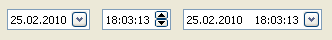
In the next picture the first control's DateMode is set to dmComboBox and the second control's to dmUpDown.
If DateMode is dmComboBox, when the user clicks on the button a calendar drops down, allowing the user to pick a date.
Note: if Kind property is set to dtkTime, the calendar control is pointless. Therefore, if DateMode is dmComboBox, the UpDown is shown instead.
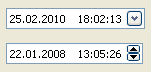
ShowCheckBox: Boolean
When set, there is a check box on the left side of the control. When unchecked, the display appears grayed and user interaction with the date or time is not possible. (The control is still enabled, though, only in sense that the check box remains enabled).
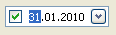
Checked: Boolean
If ShowCheckBox is set to True, this property determines whether the check box is checked or not. If ShowCheckBox is False, this property has no purpose and is automatically set to True.
DateDisplayOrder: TDateDisplayOrder
type TDateDisplayOrder = (ddoDMY, ddoMDY, ddoYMD, ddoTryDefault);
Defines the order for displaying day, month and year part of the date. When ddoTryDefault is set, then the controls tries to determine the order from ShortDateFormat global variable.
This is similar to DateEdit's DateOrder property.
DateSeparator: String
Defines the string used to separate date, month and year date parts. Setting this property automatically sets the UseDefaultSeparators property to False. To ensure that date and time separators are set to user's system defaults, set UseDefaultSeparators property to True.
TimeSeparator: String
Defines the string used to separate hour, minute, second and millisecond time parts. Setting this property automatically sets the UseDefaultSeparators property to False. To ensure that date and time separators are set to user's system defaults, set UseDefaultSeparators property to True.
UseDefaultSeparators: Boolean
When this property is set to True, then the DateSeparator and TimeSeparator properties will be set to DateSeparator and TimeSeparator global variables, which are set to user system defaults when application initializes.
TrailingSeparator: Boolean
When set to True, then the DateSeparator is shown once more, after the last date part. This property exists because in some languages the correct date format is 31. 1. 2010. including the last point, after the year.
LeadingZeros: Boolean
Determines whether the date and time parts are displayed with or without leading zeros (this actually affects day, month and hour parts of date and time display).
TimeDisplay: TTimeDisplay
type TTimeDisplay = (tdHM, tdHMS, tdHMSMs);
If Kind is dtkTime or dtkDateTime, then TimeDisplay value of tdHM means that only hours and minutes are displayed, tdHMS adds displaying of seconds and value of tdHMSMs means that milliseconds are displayed too.
TimeFormat: TTimeFormat
type TTimeFormat = (tf12, tf24);
The value of tf12 sets the display of time to 12 hours format, with AM/PM string and tf24 sets to 24 hours format.
Text which appears when the null date is set and control does not have focus. When control is focused, the text changes to defined format, but displaying zeros for date, and nines for time (for example "00/00/0000 99:99:99"), which is appropriate to user input. User can set the date to NullDate by pressing N key, provided NullInputAllowed property is True.
When TextForNullDate is set to empty string, zeros/nines format is displayed even when control does not have focus. If you want empty display, this can be acchieved by setting TextForNullDate to one or more space characters.
TDBZVDateTimePicker is a data-aware version of TZVDateTimePicker, with nice way of handling null database values.
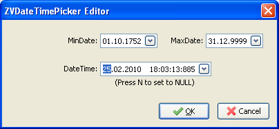
ZVDateTimePicker Editor is a dialog which provides easy way to set Date, Time, MinDate and MaxDate properties in design time. It is invoked when ZVDateTimePicker control is double-clicked in form designer. It is also shown when the elipsis (…) button, shown in Date, Time, MinDate and MaxDate properties in Object inspector, gets clicked.
Tips
Q: When the date/time value is null, how to display zeros/nines in user format, no matter whether the control is focused or not?
A: Set TextForNullDate property to empty string. If TextForNullDate is set to empty string, then zeros/nines are displayed, same as when the control has focus.
Q: When the date/time value is null, If empty string in TextForNullDate property actually sets the display to zeros/nines format, how to set the control to display nothing?
A: Set TextForNullDate property to one space character, you will get the empty display.